The intersection of optical science and personal aesthetics has emerged as a pivotal frontier in the multi-billion dollar menswear industry, as more professionals turn to personal colour analysis to optimize their wardrobes. Often dismissed as a relic of 1980s beauty culture, the practice of determining a palette based on skin undertones, hair colour, and eye pigment is experiencing a significant resurgence, driven by a shift toward "quiet luxury" and the rise of the capsule wardrobe. By identifying the specific pigments that harmonize with an individual’s natural complexion, colour analysis aims to eliminate the "washed-out" appearance often caused by mismatched garments, replacing it with a strategic approach to dressing that emphasizes health, vitality, and professional presence.
Expert practitioners, such as Lisa Doan of Sydney-based Colour Corner, argue that the process is far from a subjective trend; rather, it is a precise application of colour theory that has been utilized by artists and designers for over a century. The core objective is to ensure the wearer’s face remains the focal point, preventing clothing from "wearing the person" through excessive contrast or conflicting undertones. As the menswear market continues to evolve toward more personalized and sustainable consumption, the demand for this technical guidance has seen a marked increase among men seeking to streamline their decision-making processes and reduce retail waste.
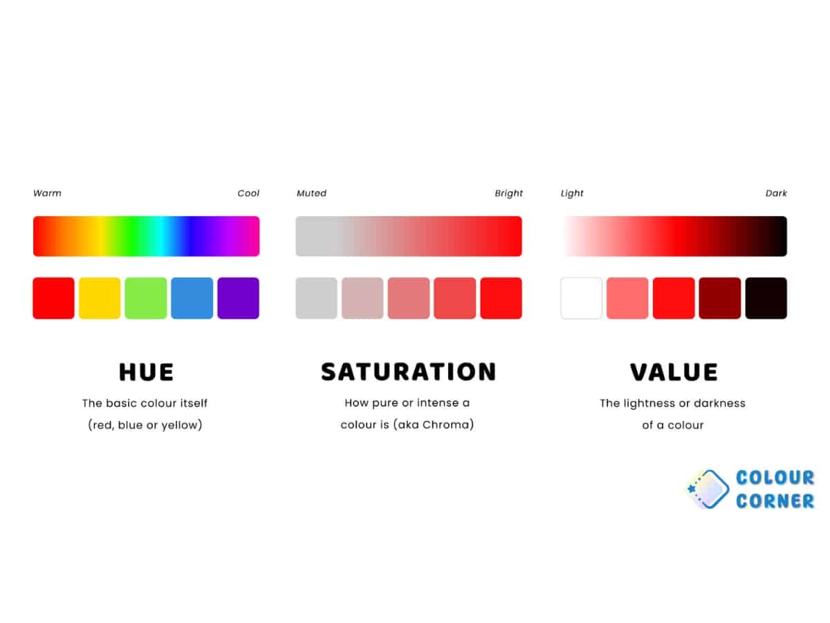
The Three Pillars of Colour Theory: Hue, Saturation, and Value
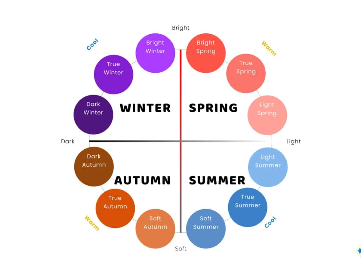
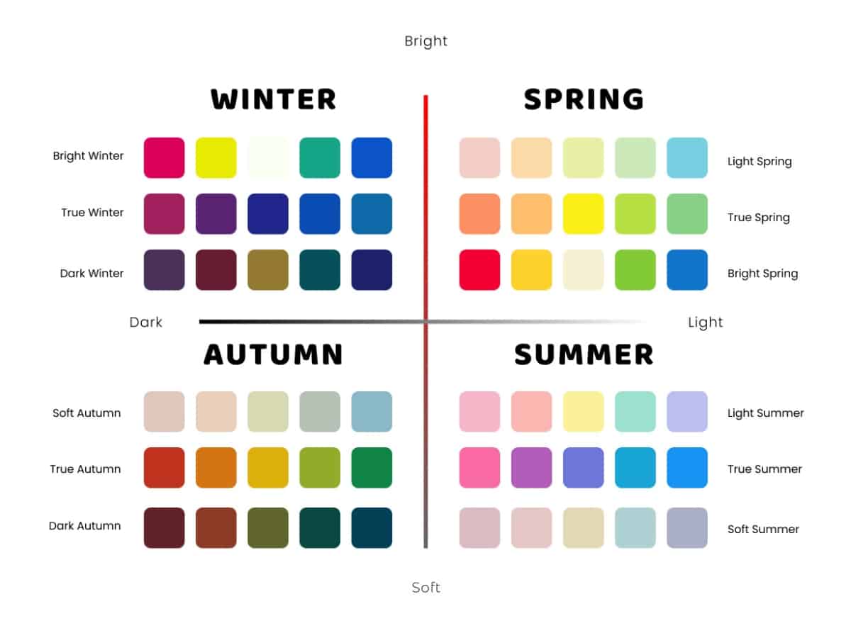
To understand the mechanics of colour analysis, one must look at the three primary dimensions of any given pigment: hue, saturation, and value. These metrics form the basis of the "Four Seasons" framework used to categorize human complexions.
Hue: The Thermal Property
Hue refers to the temperature of a colour—specifically, whether it has a blue (cool) or yellow (warm) base. In the context of human skin, this is determined by the undertone rather than the surface tone. While a person may have redness or a tan, their underlying chemistry remains constant. Warm-toned individuals generally find harmony with earthy, golden, or olive shades, while cool-toned individuals are complemented by icy blues, magentas, and crisp greys.
Saturation: The Level of Intensity
Saturation, or chroma, dictates the brightness or muteness of a colour. Some individuals possess "high-contrast" features—such as dark hair against pale skin or very bright eyes—which require high-saturation colours like cobalt or emerald to match their natural intensity. Conversely, those with "low-contrast" features, where hair and skin tones are more blended, are often overwhelmed by bright colours and look best in muted, "dusty," or "smoky" shades.

Value: The Depth of Lightness and Darkness
Value describes where a colour sits on the scale from light to dark. This dimension is crucial for determining whether a person should lean toward pastel and "ice" tones or deep, rich, and "jewel" tones. A mismatch in value can lead to a person appearing fatigued; for instance, a "Light Spring" wearing a deep charcoal suit may find the garment draws attention away from their face, creating a heavy, distracting silhouette.
A Chronology of Colour Analysis: From Bauhaus to the Digital Age
The historical trajectory of colour analysis reveals its roots in formal art education before it transitioned into a mainstream lifestyle tool.
- The Early 1900s: Swiss painter and Bauhaus teacher Johannes Itten began observing how his students’ personal palettes were reflected in their artwork. He noted that individuals instinctively chose colours that complemented their natural features, leading him to develop the concept of the "Four Seasons" as a pedagogical tool for painters.
- The 1940s-1970s: Suzanne Caygill, an American fashion designer, refined these theories into the "Caygill Method," introducing the idea that personality and style should align with one’s natural colouring. This period saw the first professional consultations for high-profile clients in Hollywood and the corporate world.
- 1980: The publication of Carole Jackson’s Color Me Beautiful transformed colour analysis into a global phenomenon. The book sold millions of copies, standardizing the "Seasonal" approach for the masses. However, the movement eventually waned as it became associated with rigid, dated fashion rules.
- The 2020s: A digital-led revival has brought colour analysis back into the spotlight. Fuelled by high-definition video platforms and a post-pandemic desire for intentional consumption, the practice has found a new audience in the menswear sector. Modern practitioners have expanded the original four seasons into a more nuanced 12-type or 16-type system, allowing for "crossover" palettes that accommodate a wider range of global ethnicities and complexions.
Case Studies: The Practical Application of Seasonal Palettes
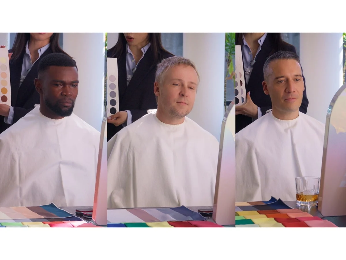
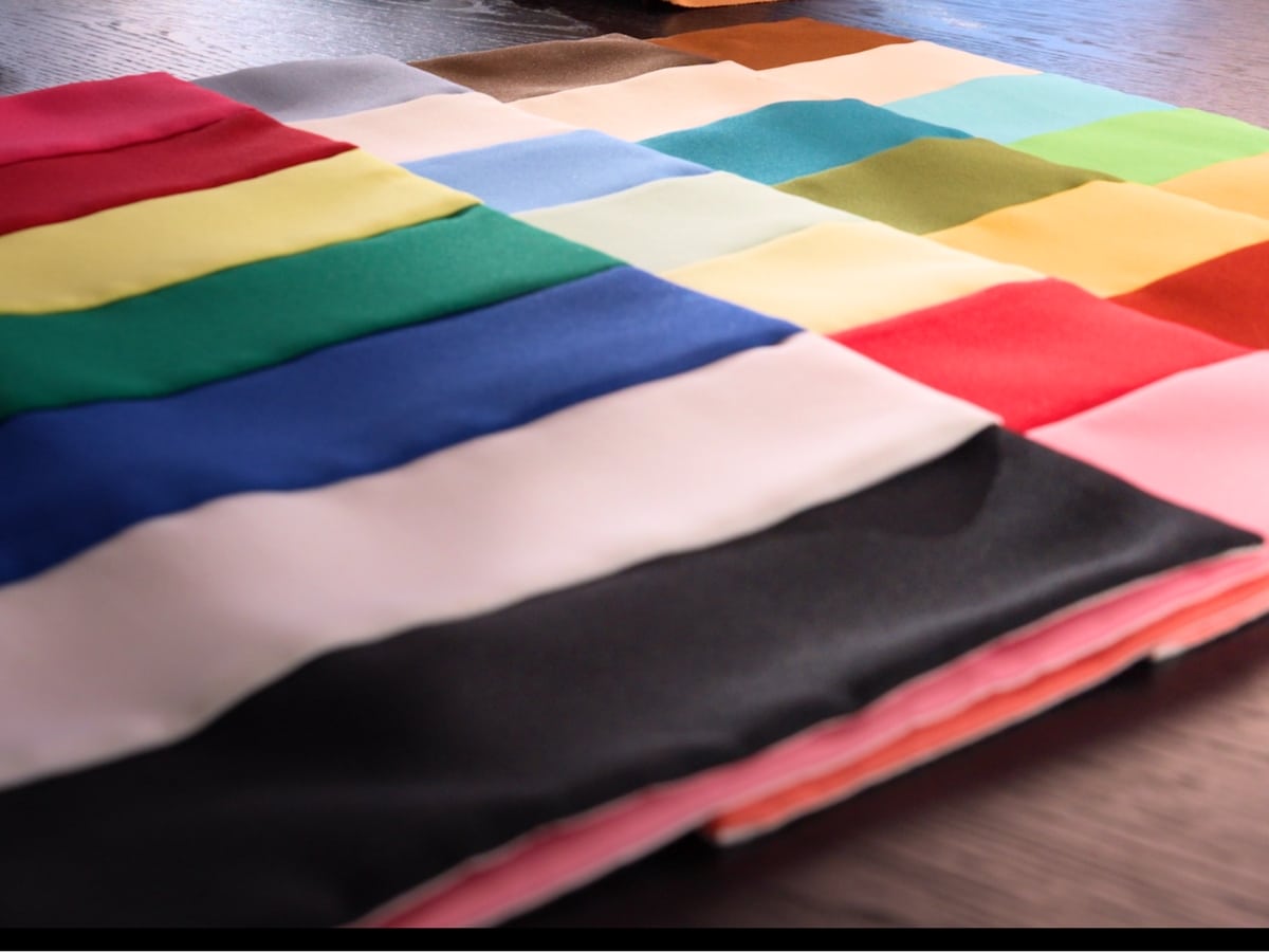
The efficacy of colour analysis is best demonstrated through comparative testing. In a recent assessment conducted by Colour Corner for the Man of Many team, three subjects with distinct complexions underwent a 30-minute "draping" session to identify their optimal palettes.
Subject 1: The True Autumn (Rob S)
Characterized by warm, rich, and earthy features, the "True Autumn" profile thrives in colours with a golden base. During the analysis, it was observed that cool, blue-based blacks and stark whites brought out purple shadows under the eyes. When replaced with olive, rust, and camel tones, the subject’s skin clarity improved significantly. For the True Autumn, the wardrobe objective is depth and warmth, utilizing a "lower value" palette that mimics the natural landscape of the season.
Subject 2: The True Winter (Frank)
In stark contrast, the "True Winter" requires high-contrast, blue-based pigments. This profile is defined by sharp, crisp features that can handle the intensity of "jewel tones" such as emerald, ruby, and true navy. While many men default to black as a safe option, the analysis revealed that only the Winter palette truly harmonizes with it. Warm, yellow-based tones like mustard or terracotta were found to make the subject appear sallow, whereas "icy" tones and high-saturation magentas defined the jawline and made the eyes more prominent.
Subject 3: The Light Spring (Rob E)
The "Light Spring" represents a warm but delicate palette. Unlike the deep richness of Autumn, Spring colours are fresh, bright, and high-luminosity. The subject found that heavy, dark colours "anchored" his features too aggressively, whereas peach, coral, aqua, and light camel kept the complexion looking refreshed. This highlights a common misconception: that all warm-toned men should wear deep browns. For a Light Spring, the key is maintaining a "high value" (lightness) throughout the wardrobe.
Economic and Environmental Implications of Colour Analysis
The rise of colour analysis coincides with a broader movement toward sustainable fashion and the "Cost Per Wear" (CPW) metric. By narrowing a wardrobe to a specific palette, consumers can achieve "effortless" mix-and-match capabilities, reducing the likelihood of purchasing "orphaned" garments—items that do not coordinate with anything else in the closet.
Market data indicates that the average consumer only wears 20% of their wardrobe 80% of the time. Colour analysis serves as a filter to ensure that future purchases fall within the 20% that actively enhances the wearer’s appearance. This shift toward intentionality has a direct impact on the fast-fashion cycle, as individuals move away from trend-based buying toward building long-term, high-quality "capsule wardrobes."
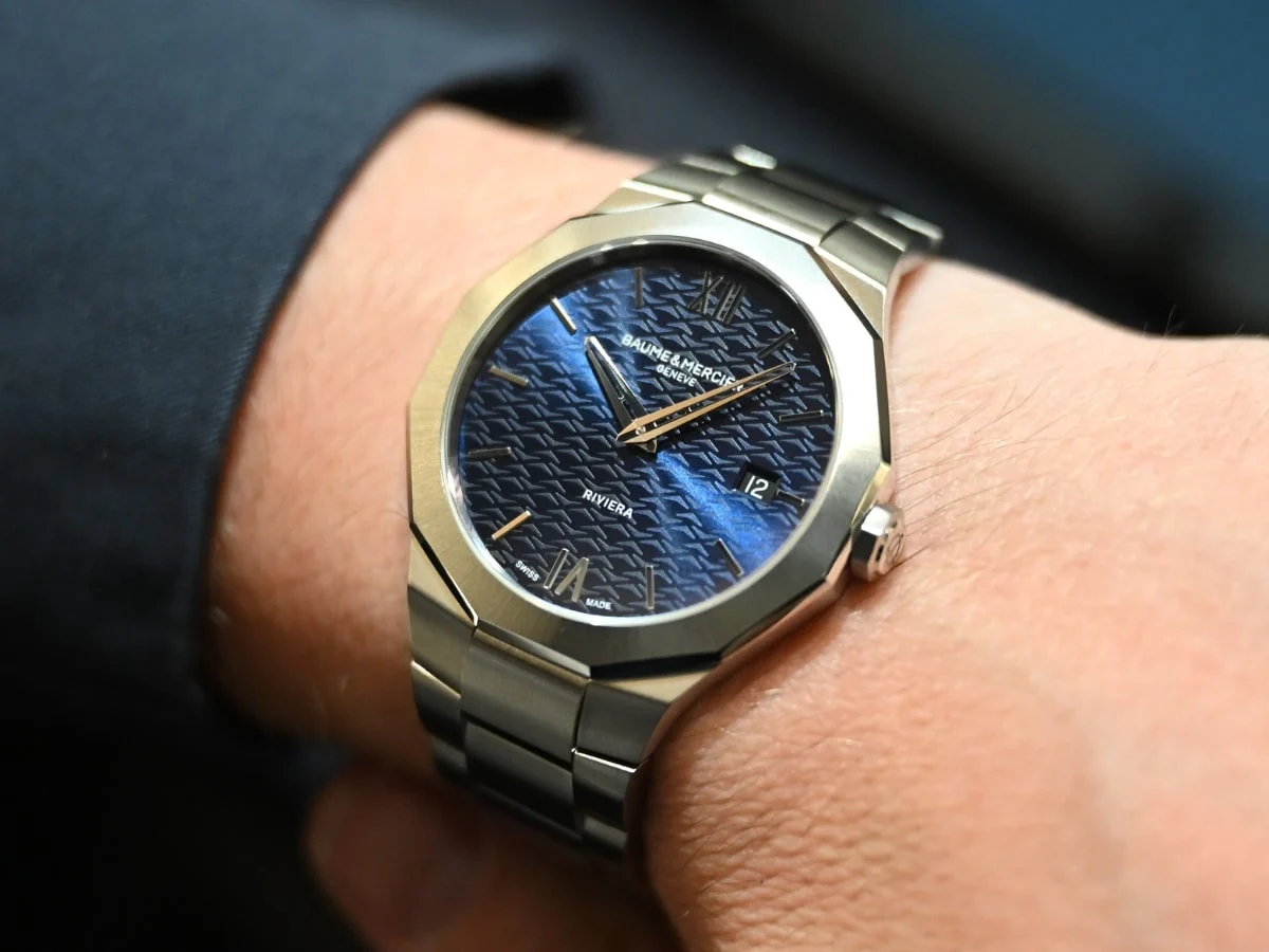
Furthermore, the grooming and hair-care sectors have begun integrating colour analysis into their service offerings. Knowing one’s season allows for more accurate choices in hair dye, eyewear frames, and even watch metals (e.g., gold for warm seasons, silver/platinum for cool seasons), creating a holistic approach to personal branding.
Professional and Psychological Impact
Beyond aesthetics, there is a psychological component to colour theory known as "enclothed cognition"—the idea that the clothes we wear affect our mental processes and the way others perceive us. In a professional setting, a man wearing a suit that harmonizes with his skin tone is often perceived as more authoritative, healthy, and detail-oriented.
Conversely, wearing "discordant" colours can subconsciously signal fatigue or a lack of self-awareness. Industry observers note that in the era of high-definition video conferencing, where lighting is often unflattering, wearing one’s "power colours" can provide a significant advantage in maintaining a professional image.
Conclusion: The Future of Personalized Retail
As the retail landscape becomes increasingly automated, personal colour analysis represents a return to bespoke, human-centric service. While AI-powered apps are beginning to offer digital colour matching, experts like Lisa Doan maintain that the physical interaction of light on skin—monitored by a trained eye—remains the gold standard.
For the modern man, colour analysis is less about restriction and more about empowerment. It provides a set of "stylistic guardrails" that simplify the shopping experience and ensure that every item in a wardrobe serves a functional and aesthetic purpose. In an age of overwhelming choice, the science of colour offers a clear path to a more efficient, sustainable, and visually impactful personal style.
Contact and Booking Information for Colour Corner
For those seeking professional consultation, Colour Corner in Sydney offers sessions ranging from an "Express Analysis" at $180 to comprehensive "Full Service" packages at $240. These sessions provide clients with physical or digital colour swatches to assist in future shopping, ensuring that the transition to a personalized palette is both seamless and scientifically grounded.