Pevita Pearce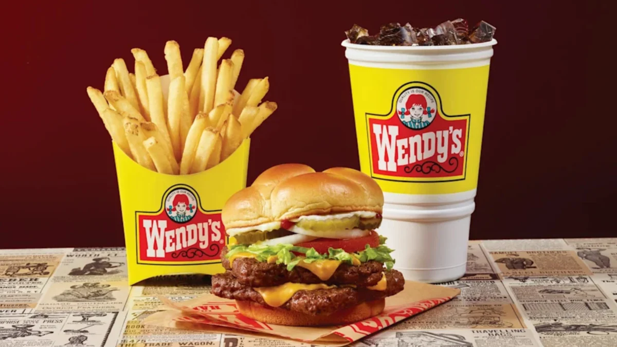
Wendy’s is officially moving to reinstate its classic yellow packaging across its entire North American restaurant network, responding to years of persistent consumer requests for a return to the brand’s vintage aesthetic. The fast-food giant confirmed that its signature burgers, chicken nuggets, French fries, and Frostys will soon be served in the vibrant yellow cups, wrappers, and boxes that defined the chain’s visual identity for decades. This transition represents one of the most significant shifts in the company’s branding strategy since its comprehensive image overhaul more than a decade ago. Tariq Hassan, Wendy’s Chief Marketing and Customer Growth Officer, noted that the decision was not merely a corporate whim but a direct response to a massive wave of feedback from the brand’s most loyal customers. According to Hassan, the return of the yellow design was one of the most frequently requested changes in the company’s history, signaling a deep-seated emotional connection between the consumer base and the brand’s mid-century origins.
A Return to Roots: The Resurgence of the Yellow Aesthetic
The rollout of the throwback packaging is scheduled to begin nationwide on September 28. While some locations may see the transition immediately, the company has planned a phased integration that will continue well into 2027, ensuring that the supply chain can accommodate the massive production requirements for thousands of franchise locations. This move marks a departure from the minimalist red-and-white color palette that has dominated Wendy’s storefronts and packaging since the early 2010s.
The yellow packaging is inextricably linked to the legacy of Wendy’s founder, Dave Thomas, who opened the first restaurant in Columbus, Ohio, in 1969. For nearly 45 years, the bright yellow containers served as a beacon for "old-fashioned" quality. The return to this color scheme is intended to evoke the "golden age" of fast food, a period characterized by the brand’s rapid expansion and its establishment as a staple of American culture. By reverting to this classic look, Wendy’s aims to bridge the gap between its historical identity and its modern status as a top-tier competitor in the quick-service restaurant (QSR) industry.
Chronology of the Wendy’s Brand Identity
To understand the weight of this decision, one must look at the evolution of Wendy’s branding over the last half-century. From its inception in 1969 until 2012, yellow was the primary accent color for the brand. It appeared on the iconic "Old Fashioned Hamburgers" signage, the interior wallpaper of restaurants, and every piece of disposable packaging.
In 2012, Wendy’s embarked on a massive "Image Activation" initiative. This was a strategic pivot intended to modernize the brand to compete with the rising "fast-casual" sector, such as Chipotle and Panera Bread. The redesign introduced a sleek, contemporary logo—removing the "Old Fashioned Hamburgers" text and simplifying the illustration of the Wendy character—and swapped the yellow packaging for a cleaner white background with red accents. While the move was initially praised for giving the brand a "premium" feel, a segment of the customer base felt that the brand had lost a piece of its soul.
The timeline of the brand’s visual history is as follows:
- 1969–1975: The foundation of the brand with the original ornate logo and yellow-heavy color scheme.
- 1978–2012: The era of the "classic" yellow packaging, which became a cultural touchstone.
- 2012–2023: The "Modern Era," characterized by red, white, and silver minimalist designs.
- 2024–Present: The "Nostalgia Revival," reintegrating the yellow aesthetic into the modern framework.
The Strategic Power of Nostalgia in Modern Marketing
The decision to bring back the yellow packaging is backed by significant marketing data suggesting that nostalgia is a primary driver of consumer behavior in the post-pandemic economy. According to industry analysts, "comfort branding" provides a sense of stability and familiarity during periods of economic or social uncertainty. For many adults, the yellow Wendy’s cup is not just a container; it is a mnemonic device for childhood memories, family road trips, and after-school gatherings.
Tariq Hassan emphasized this psychological aspect, stating that the old design reminds customers of specific "special moments" that cannot be manufactured through modern graphic design alone. "That kind of emotional connection is powerful and you can’t design it into packaging," Hassan explained. "It’s created in those special moments and something all brands hope to earn: a meaningful place in people’s lives."
By tapping into this sentiment, Wendy’s is following a broader trend within the QSR industry. Brands are increasingly realizing that while modernization is necessary for operational efficiency, the "heritage" of a brand is its most valuable intangible asset. The yellow packaging serves as a visual shorthand for the quality and consistency that Dave Thomas championed, potentially attracting older generations who grew up with the brand while intriguing younger "Gen Z" consumers who have shown a marked interest in "vintage" and "retro" aesthetics.

Broader Industry Trends: The Retro Revival
Wendy’s is not the only major player in the food industry to look backward to move forward. The "Retro Revival" has become a dominant theme across the fast-food landscape. For example, Pizza Hut has seen significant success with franchisees restoring locations to their classic 1980s appearance, featuring the iconic red roof, checkered tablecloths, and even the return of salad bars and arcade machines. Similarly, Burger King underwent a massive rebrand in 2021, reverting to a logo that closely resembles its 1970s and 90s iterations, citing a desire to return to its "authentic" roots.
The success of these initiatives is often reflected in social media engagement. When brands revive "vaulted" items or designs, they frequently go viral, generating millions of dollars in earned media. Wendy’s has already experimented with this through limited-time offers, such as the revival of the "T-Rex Burger"—a nine-patty behemoth—at select locations for eating challenges. The return of the yellow packaging is a more permanent and widespread application of this "fan-first" strategy.
Operational Logistics and Market Implications
Implementing a packaging change across more than 6,000 locations in the United States and Canada is a massive logistical undertaking. It involves coordinating with multiple paper and plastic suppliers to phase out current red-and-white inventory while scaling up the production of the new yellow materials. The decision to extend the rollout into 2027 suggests that Wendy’s is taking a measured approach to minimize waste and ensure that franchisees—who often operate on thin margins—are not burdened by the sudden obsolescence of existing supplies.
From a market perspective, this branding shift could provide Wendy’s with a competitive edge in the "Burger Wars." While McDonald’s continues to lean into a sleek, international "Global Mobile" aesthetic, Wendy’s is positioning itself as the "All-American" choice that honors its history. This differentiation is crucial in a market where consumers are increasingly looking for authenticity over corporate polish.
Furthermore, the use of color in marketing is a well-studied field. In the fast-food industry, yellow is associated with happiness, optimism, and hunger stimulation. By increasing the "visual weight" of yellow in their stores, Wendy’s may see a subtle but measurable impact on impulse purchases and overall customer satisfaction scores.
Consumer Sentiment and Official Responses
Early reactions to the announcement have been overwhelmingly positive on social media platforms like X (formerly Twitter) and TikTok, where "retro" fast food aesthetics have a dedicated following. Fans have shared photos of vintage Wendy’s memorabilia, expressing excitement that the "classic vibe" is returning.
Internal feedback from franchise owners has also been supportive. Many long-time operators who have been with the brand since the 1980s and 90s view the yellow packaging as a return to the company’s "DNA." While the modern red-and-white stores were designed to look "cleaner," some franchisees argued they lacked the warmth and distinctiveness of the original shops.
The company has clarified that while the packaging is changing, the logo itself will remain the updated 2012 version. This creates a "hybrid" brand identity—one that utilizes modern logo clarity while embracing the classic color palette that fans adore. This balance allows Wendy’s to maintain its contemporary brand standards while still delivering the nostalgic "hit" that customers are demanding.
Conclusion: A Meaningful Place in People’s Lives
As Wendy’s prepares for the September 28 rollout, the move stands as a testament to the power of the consumer voice in the digital age. In an era where brands often chase the next trend, Wendy’s has chosen to look back at what made it successful in the first place. By reviving the yellow packaging, the company is not just changing the color of its fry cartons; it is reinvesting in the emotional bond it shares with its customers.
The multi-year rollout through 2027 indicates that this is not a temporary marketing "stunt" but a long-term shift in brand philosophy. As Tariq Hassan noted, the goal is to occupy a "meaningful place in people’s lives." For millions of Americans, that place is colored yellow, smells like a fresh square-patty burger, and feels like a trip back to a simpler time. Whether this move will translate into sustained long-term growth remains to be seen, but for now, the "Yellow Era" of Wendy’s is officially back.


 Yuyun Lusiyani
 Joko Widodo
 Jia Lissa
 admin
admin